The requirement
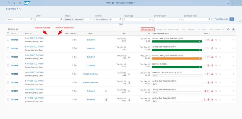
Add a button to the toolbar which is only enabled when exactly one row is selected, and which navigates to another app with some parameters based on the row’s context data. Additionally, the column Material should be split into two different columns so that it is possible to display them separately.
My approach
Before I start to get into the app in detail, let´s figure out what extension blocks can be used to implement the two tasks of the requirement.
- Add a button with custom logic to a standard Fiori app
- SAPUI5 Flexibility: Developer Adaption (Adaption/Extension Project)
- Adding two columns to a table of a standard Fiori app
- SAPUI5 Flexibility: Key User Adaption (Adapt UI)
- Extension of CDS view for data / Metadata extension for annotations
- SAPUI5 Flexibility: Developer Adaption (Adaption/Extension Project)
We already know that an Adaption or Extension Project is necessary to get the button-part done, but we need to figure out what extension block to use to add the columns.
I already wrote the extension blocks down in the order I would like to use them. Adapt UI as the quickest and easiest option to add the columns without any new development objects that would need maintenance. The extension of the CDS view or an metadata extension would also only mean to have a maximum of two new development objects, while the SAPUI5 flexibility is most hard to maintain option in my opinion.
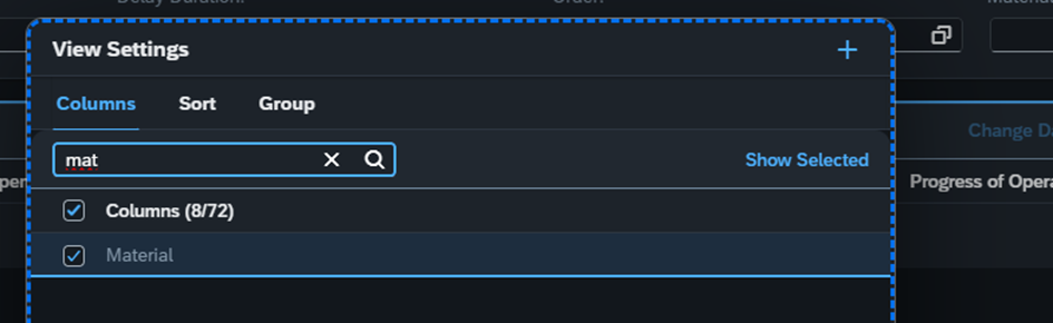
Therefore, I am opening the standard app F2336 in our launchpad, I am checking if the option “Adapt UI” is available – it is – and check if it is possible to add the Material number and material description as separate columns. Unfortunately, they are not available in this form as we can see in the following screenshot of the table settings in the UI adaption view:
Maybe this is because of some annotations in the backend. So, it would be an option to add an metadata extension or even extend the CDS view of the app to add the material fields multiple times.
To find out what CDS view is being used the easiest way in my opinion is to use the developer tools to check the network request when reading the table contents.
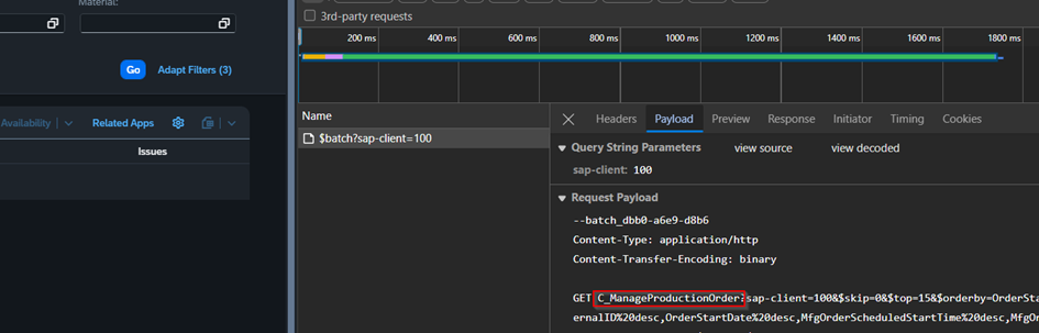
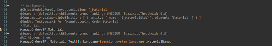
Here we can see that the CDS View C_ManageProductionOrder is being read. Hint: As this is the published entity name this is not always the same as the CDS view, but for standard apps it is the case most often. Lets open the CDS view on Eclipse with ADT:
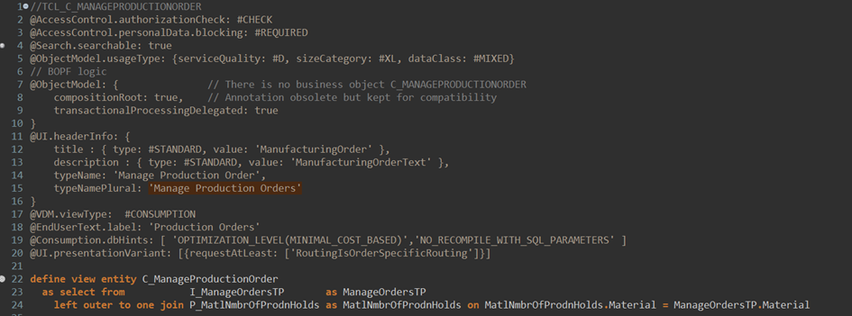
First thing we see is that this CDS view is published via BOPF. Which is not optimal, because this often means it is an older app and does not offer that much flexibility extending the backend. We can also see that the CDS view is missing the Metadata.allowExtension annotation which means it won´t be possible to create a metadata extension. Therefore, the second extension block is not an option either. The last thing we see here is that Material and MaterialName are indeed being published separately, but somehow annotated or manually configured via XML to be displayed as one column only:
Now we know that both tasks can only be done via an Adaption/Extension Project.
Before we start creating that we still want to check out the Fiori Apps Library to get a short overview of what we are handling here. SAP Fiori Apps Reference Library (ondemand.com).
When checking the supported S/4HANA Versions we see that the app was introduced with S/4HANA 1709 and is indeed old. We should also check the extensibility tab in the Implementation Information.
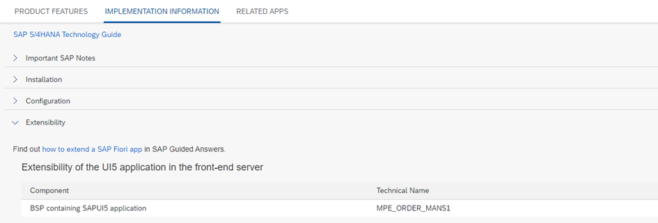
We see that there is no more information than the default one describing the BSP app. Sometimes here we can find more information or even a link (at least for newer apps) to an official Extensibility Page in the SAP Help Documentation.
We could also check out the “how to extend an SAP Fiori app” tool, which will guide us to the suggested extensibility option as well. This will inform us about all the extension blocks I described above and will also conclude to use View Extensions/Extension Points for complex extensions.
The Implementation
Task 1: Add a button to navigate to another app
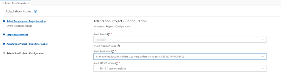
Let’s jump into SAP Business Application Studio to create an Adaption/Extension Project.
Create “New Project From Template” and select the Template “SAPUI5 Adaption Project”. This is only available when the Dev Space of BAS has been configured properly (there is a select option when creating the Dev Space to include Adaption capabilities).
In the end it should look like this:
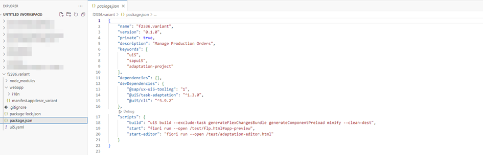
When the project has been generated properly:
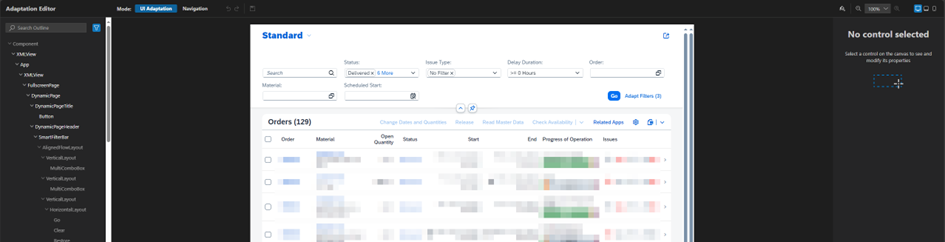
We can open the adaption editor by running npm run start-editor. It should look like this:
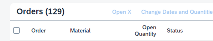
Lets start with the first task: Add a button. We add a fragment to the Overflow Toolbar:
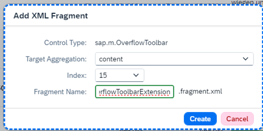
I didn’t change the Index – which will add the button to the end of the toolbar, instead of the beginning – because the editor seems to have a bug. There will always be an error: Could not get command for ‘addXML’. “0” is of type string, expected int for property “index” of ManagedObject sap.ui.rta.command.AddXML#__xml5.
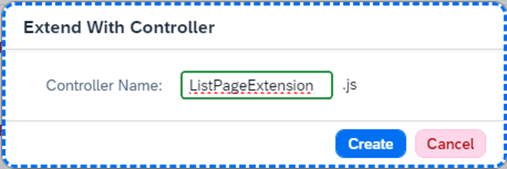
Additionally, I added a controller extension which will contain the logic for our button. It doesn’t matter what element is selected, the controller extension will always be on page level.
After that we save the current state of the adaption editor (save icon in the top) and switch back to BAS. Here we will see that the changes-Folder has been filled with subfolders containing the Controller Extension and the Fragment, as well as some .change-Files which describe those changes. They will be interesting later, when changing the Index of the extension to move the button to the front of the toolbar.
Lets open the fragment and add a button which is disabled by default (as it should only be enabled when exactly one row is selected), which will call a method of our newly created controller extension.
<core:FragmentDefinition xmlns:core='sap.ui.core' xmlns='sap.m'>
    <Button id="btnGotoX"
        text="{i18n>openX}"
        press=".customer.f2336.variant.ListPageExtension.handleOpenXButtonPressed"
        enabled="false" />
</core:FragmentDefinition>
Lets check the result in the editor:
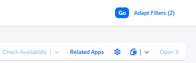
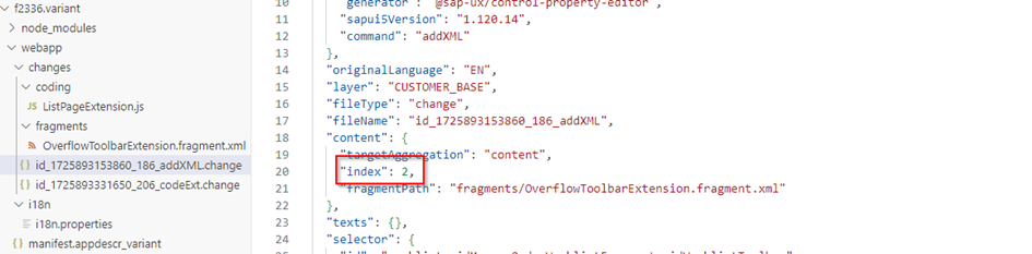
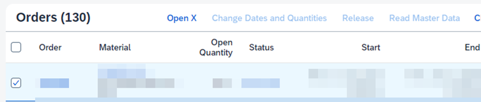
Great! Now we move the button to the right by changing the index of the extension manually in the .change file. In this case the index must be 2, as 0 would be before the table header text and one would be before the spacer:
This looks good:
Next we need to make sure there is some logic to enable and disable the button automatically based on how many rows are selected in the table. To do that we need to catch the selection event of the table by adding the following code to the controller:
const oTable = this.getView().byId("application-X-X-component---worklist--idManageOrderWorklistFragment--idOrdersTable");
oTable.attachSelectionChange(this._handleOrdersTableSelectionChange, this);
as well as another method to do the enabling/disabling of the button
_handleOrdersTableSelectionChange: function(oEvent) {
    const oTable = oEvent.getSource();
    const aSelectedContexts = oTable.getSelectedContexts();
    const oButton = this.getView().byId("application-X-X-component---worklist--customer.f2336.variant.btnGotoX");

    oButton.setEnabled(aSelectedContexts.length === 1);
}
If we check the editor now the button should be enabled when a row is selected, which works like a charm:
Last but not least lets implement the logic to navigate to another app, which could look like this:
const oTable = this.getView().byId("application-X-X-component---worklist--idManageOrderWorklistFragment--idOrdersTable");
const oSelectedContext = oTable.getSelectedContexts()[0];
const oObject = oSelectedContext.getObject();

const oCrossAppNavigator = sap.ushell.Container.getService("CrossApplicationNavigation");
let hashUrl = (oCrossAppNavigator && oCrossAppNavigator.hrefForExternal({
     target: {
          semanticObject: "X",
          action: "X"
     },
     params : {
          "Material": oObject.Material
     }
}));

oCrossAppNavigator.toExternal({target: {shellHash: hashUrl}});
Done!
Task 2: Add the two additional columns Material number and Material description
For this one, lets open the Adaption Editor again, select the table and press “Add XML Fragment”. Here we need two XML Fragments, one for the aggregation “columns” (to create the columns itself) and one for “items” (to fill the newly created columns with text).
Column Extension Fragment:
<Column
     customData:p13nData='\{"columnKey":"Material", "leadingProperty": "Material" , "sortProperty" :"Material", "type": "text"\}'
     id="idExtColumnMaterial">
     <header>
          <Text id="idExtColumnMaterialText" text="{i18n>material}" tooltip="{i18n>material}"/>
     </header>
</Column>
<Column
     customData:p13nData='\{"columnKey":"MaterialName", "leadingProperty": "MaterialName" , "sortProperty" :"MaterialName", "type": "text"\}'
     id="idExtColumnMaterialName">
     <header>
          <Text id="idExtColumnMaterialNameText" text="{i18n>materialName}" tooltip="{i18n>materialName}"/>
     </header>
</Column>
Item Extension Fragment:
<VBox id="idExtCellMaterialNameVBox">
     <Link id="idExtCellMaterialNameLink" text="{Material}" press="handleMaterialLinkPress"></Link>
</VBox>
<Text id="idExtCellMaterialNameTextObj" text="{MaterialName}" />
Done!